Load Profile of a Pandemic: California Bay Area Counties
We explore the effects of the COVID-19 pandemic, and the associated safety precautions implemented by all levels of government, on electricity demand. We conduct exploratory data analyses and visualizations of specific societal and economic sectors, which do not appear to have been carried out thus far. In this article we contrast and visualize the data about how different electric consumer segments have behaved. This examination may provide a useful guide for the challenges ahead of utility companies, as electric demand continues to evolve in the wake of the pandemic.

Expert Data Scientist, Pacific Gas & Electric
Introduction/motivation - why is it interesting/useful to look at how electric demand has changed?
The COVID-19 pandemic, and the associated safety precautions implemented by all levels of government, are having dramatic effects on how society behaves, affecting individuals, schools, and businesses large and small. Many companies are struggling to adjust to rapidly shifting consumer behavior. This includes electric utility companies, who have the responsibility to provide reliable service to their customers, regardless of the unprecedented nature of ongoing events.
Demand for electricity is traditionally one of the most consistent consumer behavior patterns. Monday through Friday, people go to work, and the demand for electricity moves with them into areas dense with commercial and industrial buildings. At night, when individuals return home, electric demand shifts back to residential areas. COVID-19 has affected both the location of demand, as well as the scale, as many businesses are shut down and many consumers have changed their regular daily routines. With nearly all non-essential residents being asked to remain in their homes and no longer needing (or being unable) to commute to work, it is natural to expect an increase in residential demand and a subsequent decrease in commercial.
The ability to effectively supply electricity to consumers relies on an accurate forecast of demand. Given these changes in location and scale, utilities, independent power producers, load balancing authorities, and others who participate in electricity markets are faced with a new challenge: they must forecast shelter in place energy demand, and they must do so without a large history of data to rely on. A variety of publications have pointed out the significant shifts in overall electric demand of large market served areas such as CAISO [1,4,9], NYISO [2,5,9], and globally [9]. However, exploratory data analyses and visualizations of specific economic sectors do not appear to have been carried out. Under shelter in place orders, most schools are closed entirely, but medical facilities are working around the clock. One expects schools to have minimal electric demand under these conditions, while medical facilities might be increasing their demand. In this article we contrast and visualize the data about how different electric consumer segments have behaved.
Methodology
In the analysis that follows, we compare recent electric demand in the service territory of Pacific Gas and Electric (PG&E) to the equivalent period in 2019.
There were several specific questions used to focus this analysis. How do the different counties in the Bay Area contrast in their electric demand? How do urban and residential areas contrast? How do residential consumers differ from non-residential? How do different economic sectors (broken out by NAICS code groups) behave? Each of these questions is examined through visualizations below.
As the impact of COVID-19 continues to evolve, additional analysis is warranted. Some examples not covered in this article include analyzing whether the shifts in electric demand are permanent behavior changes, reflecting lasting societal changes (for instance far greater prevalence of adults working from home), and further detailed exploration of which type of medical and social service facilities are seeing lower or higher use.
PG&E electric usage data, aggregated to hourly intervals was used for this analysis beginning March 1, 2020. Electric usage data for a comparable period in 2019 was also included. Since demand mostly varies by hour of the day and day of the week (weekday versus weekend), when comparing between years rather than matching by calendar date, matches were made by day of the week, week number, and hour. Data about individual electric consumers usage was then aggregated in a variety of different ways, as specified in each of the figures in the next section.
While the influence of weather on electric demand is not taken into account, this analysis is either comparing different demand segments in the same location, and therefor experiencing the same weather, or nearby areas that experience similar weather patterns. Future analysis could normalize for weather in order to develop a deeper understanding of the findings shown here.
Note: This analysis recognizes the privacy of utility customer usage information and adhered to the California Public Utility Commission’s aggregation rules that protect this privacy.
Results
Figure 1 shows the total PG&E service territory electric demand and a timeline of when employees increasingly became encouraged to work from home. Tech companies like Twitter and Facebook were the first to close their offices during the first week of March. Google and a number of financial institutions followed suit the next week. However, many Bay Area companies did not completely close their doors until it was officially mandated on March 17. The order applied to 6 Bay Area counties - Alameda, Contra Costa, Marin, San Francisco, San Mateo, and Santa Clara. Here and in all subsequent figures, the demand curve for 2020 is colored orange, while the demand for the comparable period in 2019 is blue. The light green shade highlights the difference in peak hourly demand between one representative weekday during the first 2 weeks of April 2020, and its corresponding day in 2019. This day is chosen as close as possible to the median full day difference in demand from the equivalent day in 2019. The relative difference in percentage points between the day peak in 2020 and in 2019 is denoted in black text. The equivalent numbers are also plotted in all subsequent hourly demand plots.
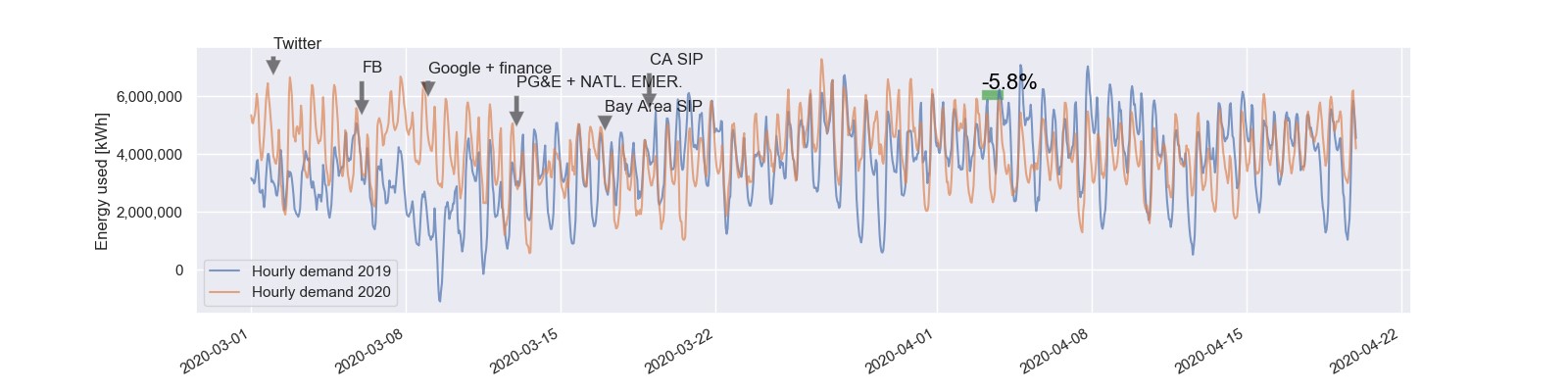
Figure 1 - Total PG&E Service Territory Electric Demand
Figure 2 focuses on 4 of the 6 Bay Area counties that ordered shelter in place first. The same conventions apply as those outlined in Figure A, with one exception – a black dashed line represents the date the Bay Area went into a shelter in place order, and the brown dashed line denotes the date the state of California issued a shelter in place order. These additional conventions will persist through the remaining figures. When comparing the equivalent days and weeks of 2020 to the previous year, San Francisco, San Mateo, and Santa Clara show notable drops. Marin county does not. This is most readily evident in the last graph which contains the relative percentage difference between 2020 and 2019 hourly demand for each county in one plot. The bold line represents Marin county, and since the shelter in place begins, this line regularly shows lower decrease in demand than the other counties. A situational understanding of the California Bay Area supports this distinction, as comparatively Marin County has a much lower non-residential presence, both absolute and relative to the county’s population (from references [10-13] one can find total number of people employed as well as total population in each of the 4 counties mentioned). This contrast suggests that areas that have significant places of work are seeing significant drops in demand, while areas dominated by residential environments (Marin) are seeing little overall change in demand.
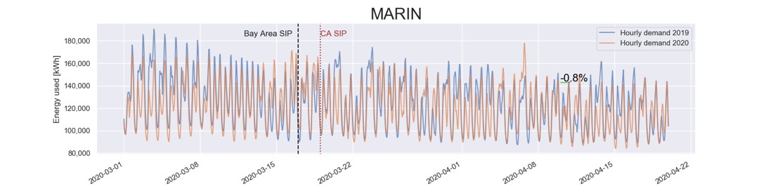
Figure 2 - Demand by County
How do the different counties in the Bay Area contrast in their electric demand?
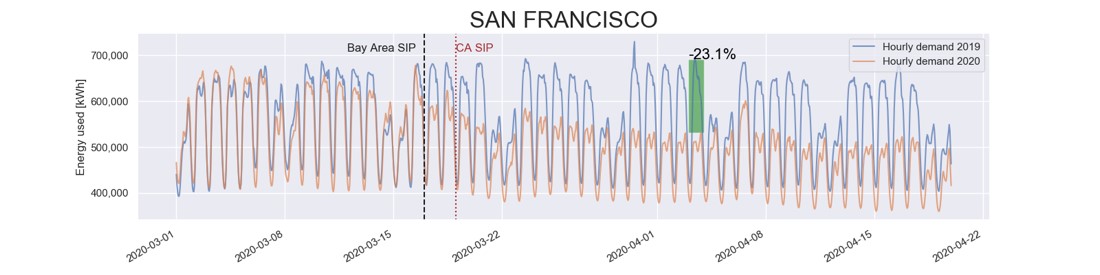
Figure 2 - Demand by County
How do the different counties in the Bay Area contrast in their electric demand?
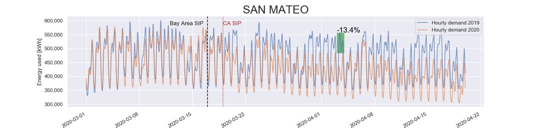
Figure 2 - Demand by County
How do the different counties in the Bay Area contrast in their electric demand?
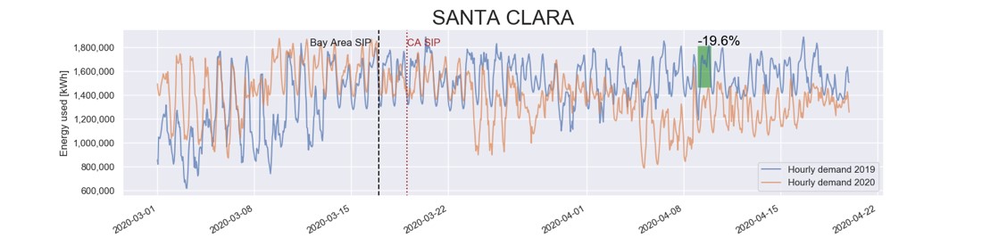
Figure 2 - Demand by County
How do the different counties in the Bay Area contrast in their electric demand?
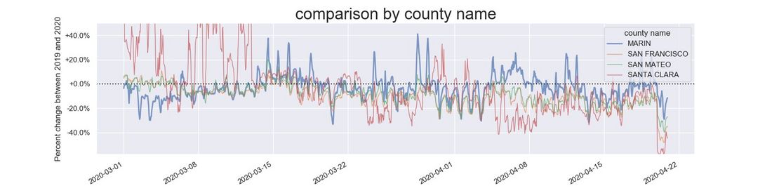
Figure 2 - Demand by County
How do the different counties in the Bay Area contrast in their electric demand?
Figure 3 shows demand from 3 PG&E substations in San Francisco. The Embarcadero substation supplies the downtown San Francisco area, which is a dense urban center of tall office buildings. Here there is a clear and significant reduction in electric demand. Typically, tens of thousands of commuters move in and out of San Francisco every day, primarily to the downtown area. During COVID-19, presumably a majority of the office buildings in this area are running idle. The Castro station supplies a far more residential area of San Francisco, and shows a small increase compared to the trend before the shelter in place started. The Mission substation serves a residential area, with significant commercial zones included, albeit not at the density and numbers of downtown. In the Mission substation, there is also a clear reduction in electric demand.
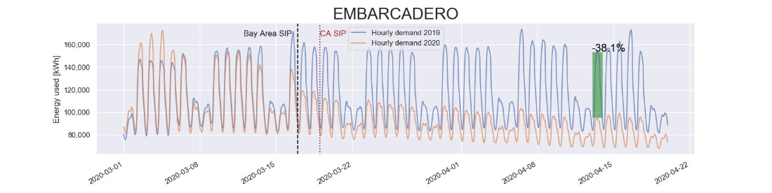
Figure 3 - Demand by Substation
How do urban and residential areas contrast?
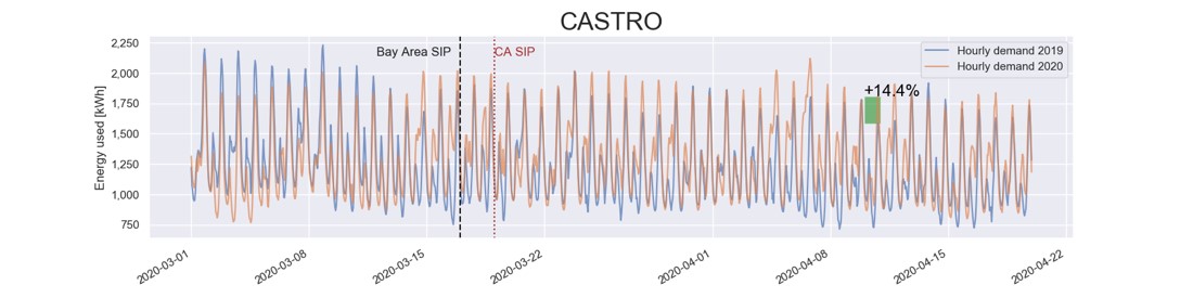
Figure 3 - Demand by Substation
How do urban and residential areas contrast?
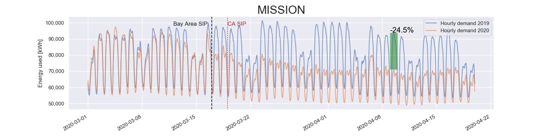
Figure 3 - Demand by Substation
How do urban and residential areas contrast?
Figure 4 depicts the service area of the 3 substations in San Francisco. 300 random service point locations supplied by each of the substations were selected and plotted against a map of San Francisco.
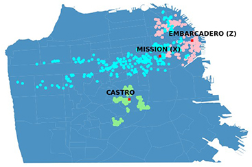
Figure 4 - Service area of the 3 substations
Figure 5 shows the aggregated demand from the 3 previously mentioned PG&E substations in San Francisco (Embarcadero, Castro and Mission), but segmented into residential and non-residential consumers. Residential customers account for 95% of service points supplied by the Castro substation, 89% of service points supplied by the Mission substation, and 86% of service points supplied by the Embarcadero substation. The figures demonstrate residential demand has seen a significant increase. Commercial demand, on the other hand, has decreased dramatically.
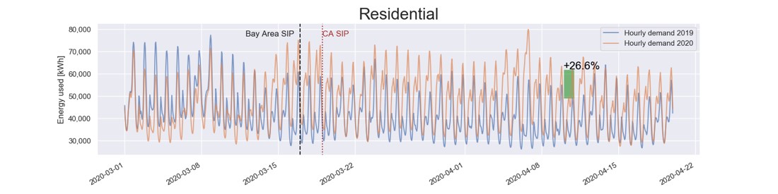
Figure 5 – Residential vs. Commercial Demand
How do residential consumers differ from non-residential?
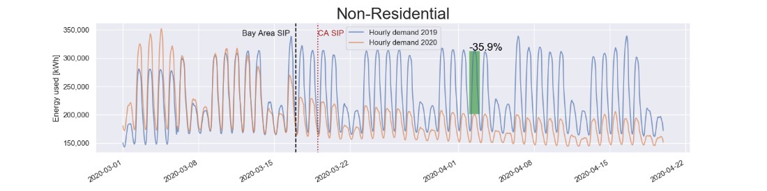
Figure 5 – Residential vs. Commercial Demand
How do residential consumers differ from non-residential?
Figure 6 shows demand from commercial consumers, a subset of non-residential consumers, in the 3 PG&E substations in San Francisco (Embarcadero, Castro and Mission), but limited to a small number of segments identified by the NAICS code groups of the commercial consumers. Health care and social assistance (2-digit NAICS code 62) have seen modest decreases overall. A further differentiation between social services and medical facilities is probably warranted. In contrast, manufacturing (2-digit NAICS codes 31, 32, 33), education (2-digit NAICS code 61), and accommodations & food services (2-digit NAICS code 72) have all seen dramatic decreases in demand. The final graph shows the relative percentage differences between demand in 2019 and 2020 for these commercial sets. It is readily evident that throughout the entire shelter in place period, health care and social assistance have seen the least decrease in demand of the commercial set.
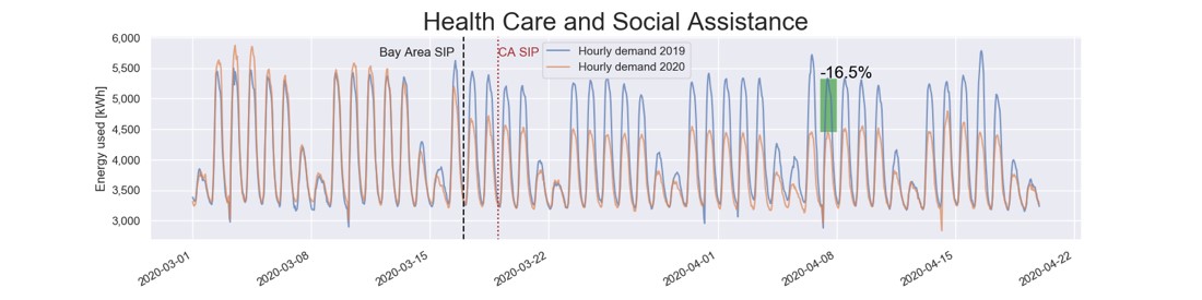
Figure 6 – Contrasting Commercial Segments
How do different economic sectors behave?
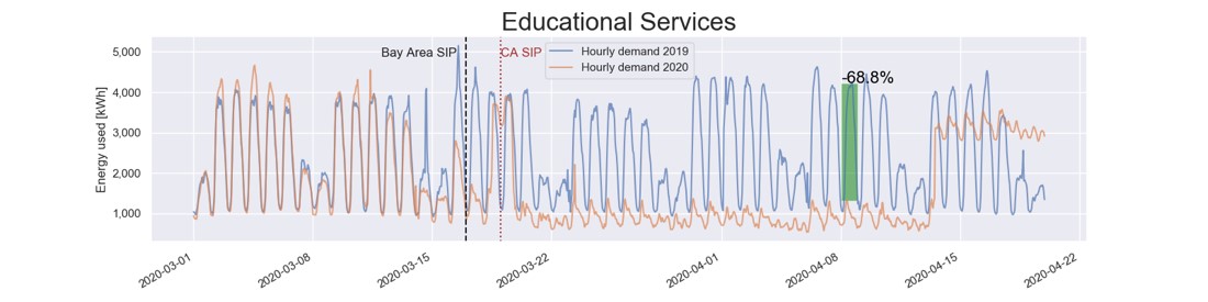
Figure 6 – Contrasting Commercial Segments
How do different economic sectors behave?
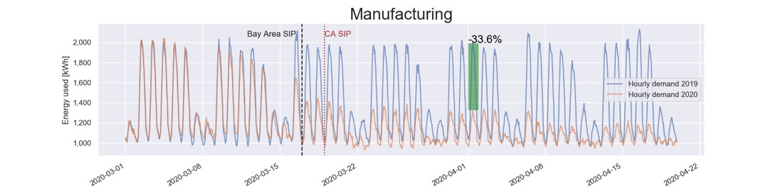
Figure 6 – Contrasting Commercial Segments
How do different economic sectors behave?
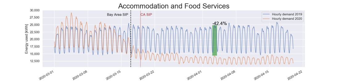
Figure 6 – Contrasting Commercial Segments
How do different economic sectors behave?
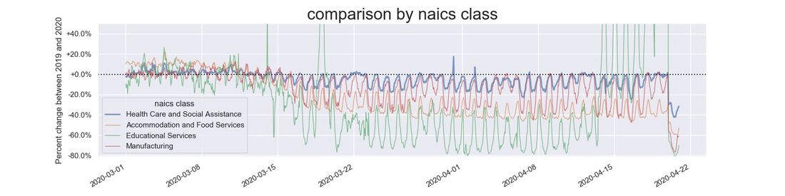
Figure 6 – Contrasting Commercial Segments
How do different economic sectors behave?
Conclusions
This exploratory data analysis finds that while the total PG&E service area demand is slightly less than it was a year ago, counties with proportionally higher non-residential electricity consumers are seeing noticeably lower demand, the most evident cases being in the San Francisco, San Mateo and Santa Clara counties. From the plots, it is clear that the decrease in demand is driven by the commercial sector. Utilities that serve major urban centers with large numbers of working commuters likely also have experienced significant drop in demand. Analysis at the NAICS code level outlines the impact COVID-19 is having on the electricity consumption of a variety of different economic sectors. Going into the summer months, it may be useful for utilities to adjust forecasts of peak summer demand to accommodate for these changes in usage profiles, given that significant numbers of workers may continue to work from home, despite the winding down of shelter in place orders.
Forecasting electric demand using a purely technical analysis has been immensely successful historically, since electric consumption is an extremely regular human activity. However, the outbreak of the COVID-19 pandemic represents an abrupt, dramatic shift in demand patterns. Such a “black swan” event is notoriously hard to model. As societies slowly emerge from shelter in place conditions, and ramp up parts of the economy, how will electric demand change?
Forecasting what the relaxing of shelter in place looks like will pose challenges, as there is no comparable data on record. However, by understanding the drivers of the dramatic shifts in electric demand, one can use simple assumptions to predict what changes in demand patterns are likely to occur. For example, if schools remain closed, it is reasonable to assume that their demand will remain at their current level. As various business segments return to their previous operation scale it is reasonable to assume that their demand will return to some degree of normal. As such, a “bottoms-up” forecast of demand based on NAICS code could prove to be a valuable exercise.
Utility companies that have information to group their consumers by commercial segment and geographic location should be able to roughly predict how the electric demand patterns will change both in magnitude and location on the grid. As demonstrated in this exploratory data analysis presented here, one can see from data how much demand has been lost in each commercial segment. It is then a question of determining which segments will return to normal, and to what extent.
References
[1] http://www.caiso.com/Documents/COVID-19-Impacts-ISOLoadForecast-Presentation.pdf
[2] https://www.greentechmedia.com/squared/dispatches-from-the-grid-edge/new-yorks-coronavirus-shutdown-and-its-challenge-to-the-demand-response-industry
[3] https://www.greentechmedia.com/squared/storage-plus/sources-of-industrial-resilience-amid-the-chaos
[4] https://www.greentechmedia.com/articles/read/california-renewable-curtailments-spike-as-coronavirus-reduces-demand
[5] https://www.greentechmedia.com/articles/read/how-new-yorks-coronavirus-lockdown-is-driving-down-power-demand
[6] https://www.nyiso.com/documents/20142/11883362/NYISO_COVID.pdf/3660412f-c7a7-89a4-a2c5-0af3ff33d90c
[7] https://www.nyiso.com/covid
[8] https://www.washingtonpost.com/business/2020/04/19/electricity-new-york/
[9] https://grist.org/energy/how-coronavirus-is-changing-electricity-usage-in-3-charts/
[10] https://www.census.gov/quickfacts/marincountycalifornia
[11] https://www.census.gov/quickfacts/sanfranciscocountycalifornia
[12] https://www.census.gov/quickfacts/sanmateocountycalifornia
[13] https://www.census.gov/quickfacts/sanclaracountycalifornia
Thumbnail credit: Photo by Matthew LeJune on Unsplash
Suggested content